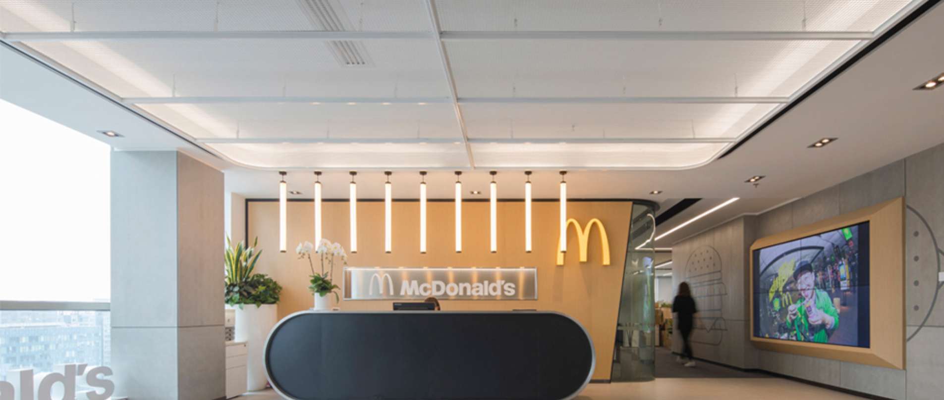
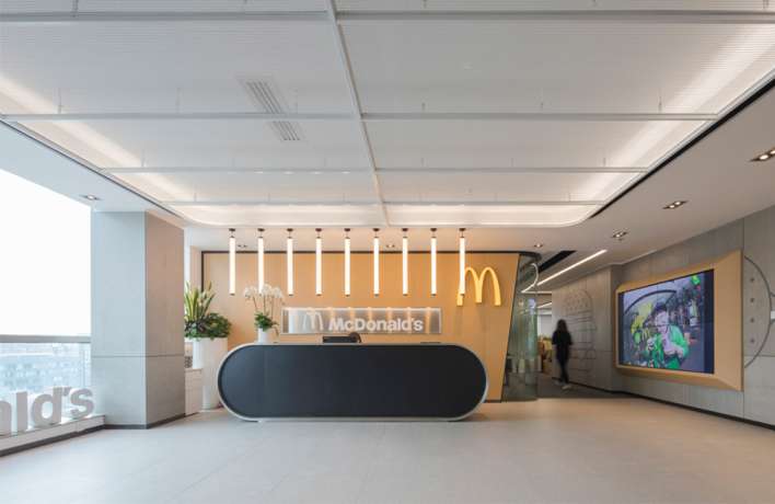
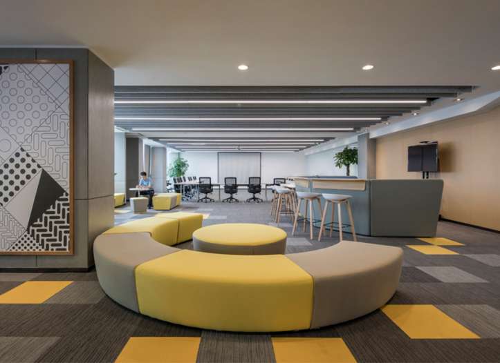
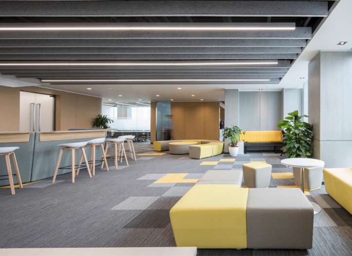
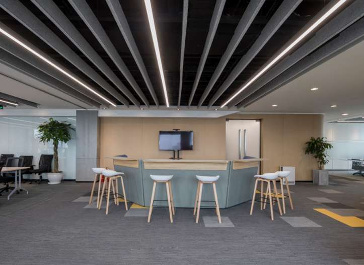
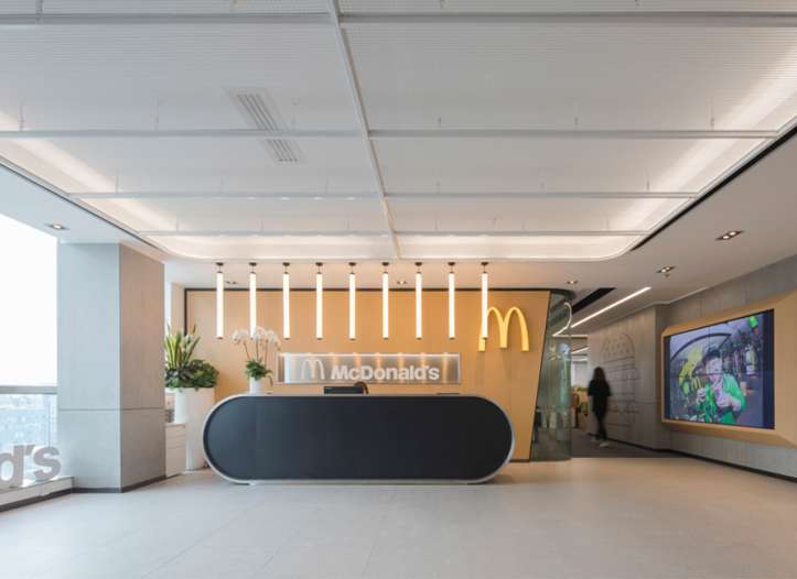
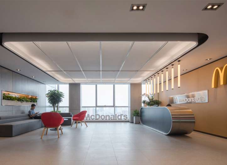
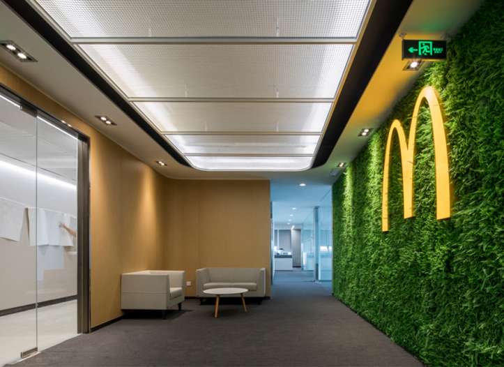
The new brand image has also defined the working environment of the corporate. We will give you a tour to their headquarters in the central business area of Beijing, China. Based on the new brand image, Lamex has finished a series of user analysis, space allocation and color study to give out the most suitable and effective modern workplace solution.
User Analysis: Z Generation is the majority workforce of McDonald’s.
The corporate is comprised of different departments and people of difference ages. According to “Manager” Magazine, McDonald’s has more than 100,000 employees while 65% are born in 90’s. It implies that the majority of McDonald’s workforce is the Z generation.
The “Neighborhood” Concept by Lamex is actually suitable for the Z generation. This concept is more than just about working. It actually combines 3 major areas which are focus area, collaborative area and relaxation area. The difference between these 3 areas is the scale of the work-life balance. These areas are co-related like Hutong District in Beijing, where we can realize the individual working style, lifestyle and their relationship with each other by analyzing the activities in different areas.
Space Allocation: Collaboration and Relaxation are the focal points
It is the headquarters of McDonald’s in Beijing, where many parties come and gather. The design of the collaboration and relaxation area becomes the focal points of the workplace design. From activity space, waiting space to storage space, Lamex takes great cares of these areas. According to the study of space allocation, people tend to have these areas to catalyze the communications between departments and satisfy the cultural needs, creating a comfortable workplace at last.
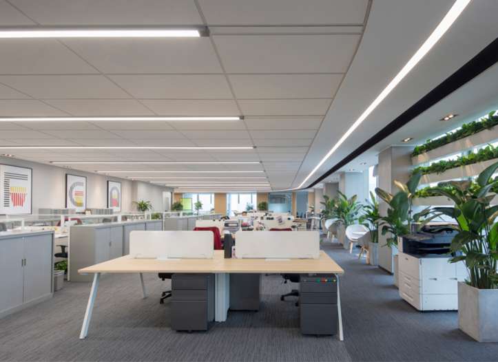
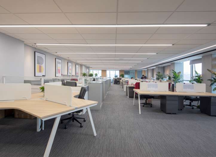
Focus, Collaboration and Relaxation are the 3 major elements of Lamex Open Workplace Solution. In an open workplace, people are able to enjoy a better environment with better design, adjustable furniture, versatile working style, better noise control and better external communication, etc.
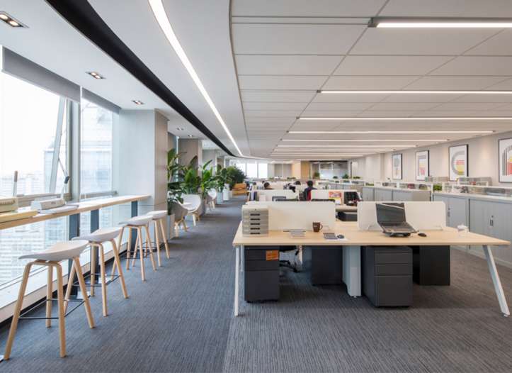
The Avail Bench, 120 ° Avail Bench and Height-adjustable desk by Lamex provide versatile focus work solutions to satisfy different working needs.
Avail Bench is easy to reconfigure to provide versatile layouts for Focus and Collaborative areas.
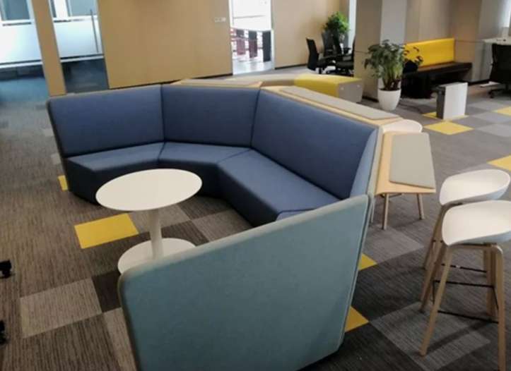
120 ° Avail Bench with frameless panels satisfy the needs for individual works and small team collaboration.
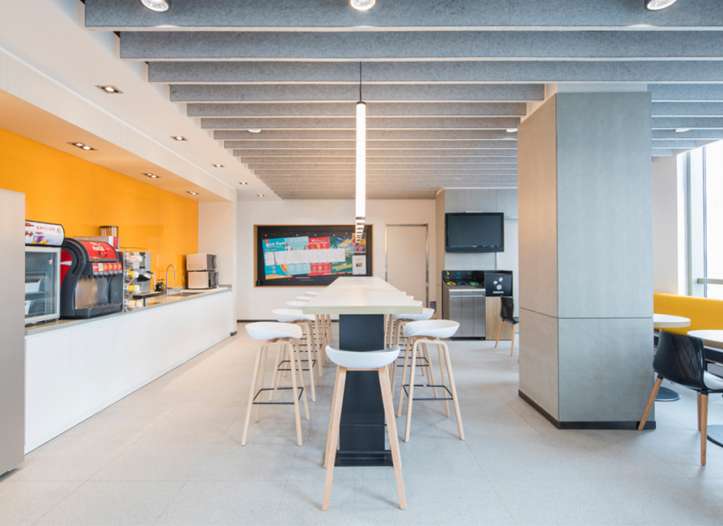
Extendible desk provides a very nice solution for extension. It encourages people to have quick and small meeting to foster their cooperation and improve the space and time allocation.
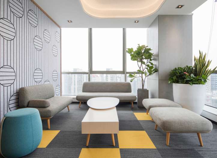
Relaxation areas are setup throughout the workplace to make a better use of interior space. For those who love to work in areas like Coffee Bar and Outdoor Activity Area, they now have more options to find their suitable working environment in order to foster their working efficiency and productivity.
Lamex fantastic lounge chairs and sofa with simple design and wood texture are suitable for relaxation areas. It is very nice to enjoy a cup of coffee and enjoy the lovely city view on it.
The ingage sofa is created by the Gensler Design Director - Steve Meier and his design team. It is inspired by the natural curve of cobblestone, and imitating the comfort of the natural environments.
The Meta sofa and bench provides versatile combinations to create a sense of all-round comfort for the interior. From small group meeting to socializing, it is able to inspire people and satisfy different working needs.
Meta Octagon with the extended desktop at the back supports different working styles. It allows people to stand, sit, chat and work as group. It is very fascinating.
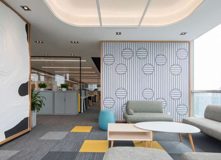
In term of color, McDonald’s is switched from the traditional red to yellow. By combining the solutions with yellow tone, Lamex provides a bright, elegant and modern workplace to bring joy and happiness to people. It also advocates the latest concept of McDonald’s “Make everyone relaxed and comfortable”.
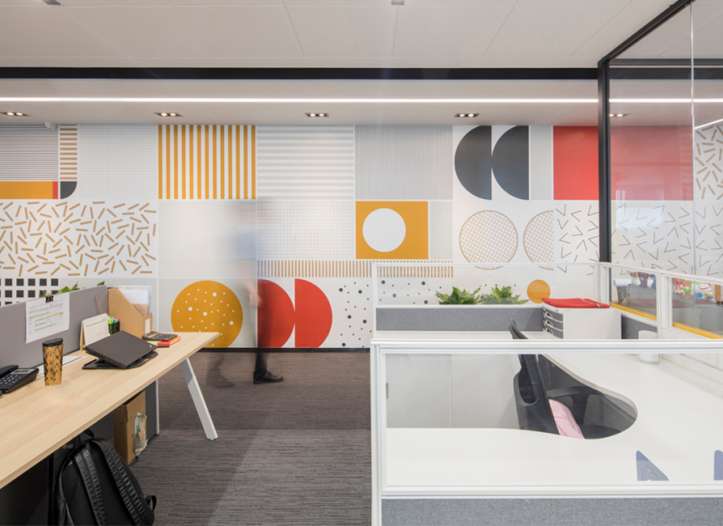
Different series by Meta with different colors are mainly used to create the warm and comfortable sensation for the workplace. In terms of the interiors, McDonald’s tends to weight more on the natural lighting. Also, the special paintings on walls give a vivid and fresh feeling for the workplace.
Generally, the workplace design is simple but elegant. The warm yellow, elegant grey and simple white, align with every details of the interior, making it an ideal workplace for the Z generation.
